As noted in the biographical notes, Carl took a correspondence course in commercial art and illustration from the mid 1960’s to early 1970s. He did not preserve all his exercises, but it can be assumed that the ones he did save represented for him his best work in this genre. This is also an appropriate heading under which to show his sketches for a logo-design contest.
Before he took that commercial art course, he also completed a cartooning course by correspondence. Some of the work he did for that is included here.
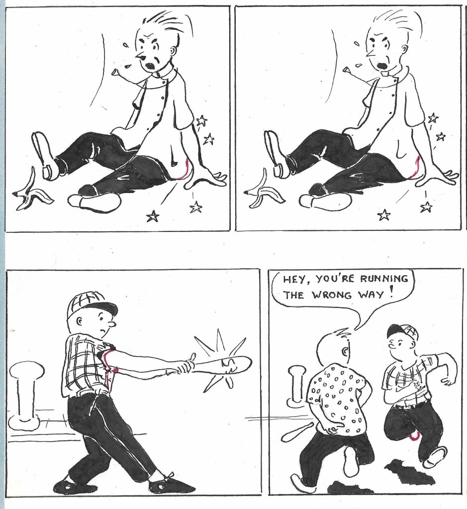
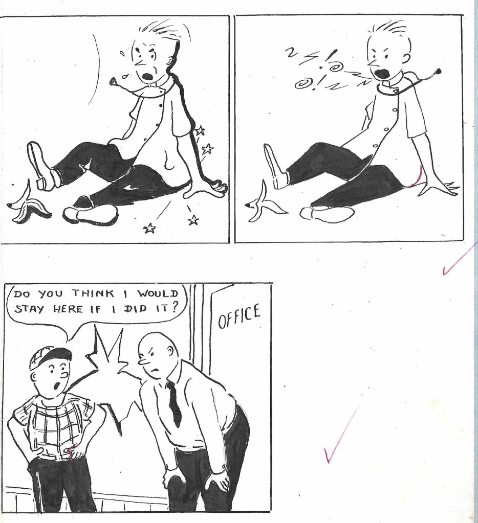
Finally, I am including a comic book he started for his son Peter, a Tintin fan, in the late 1950s, when the family was still living in Amsterdam. It is in very poor condition, but worth preserving. Hans Groen was the name of Peter’s closest male friend at that time.
Comic Strip “Peter & Hans”
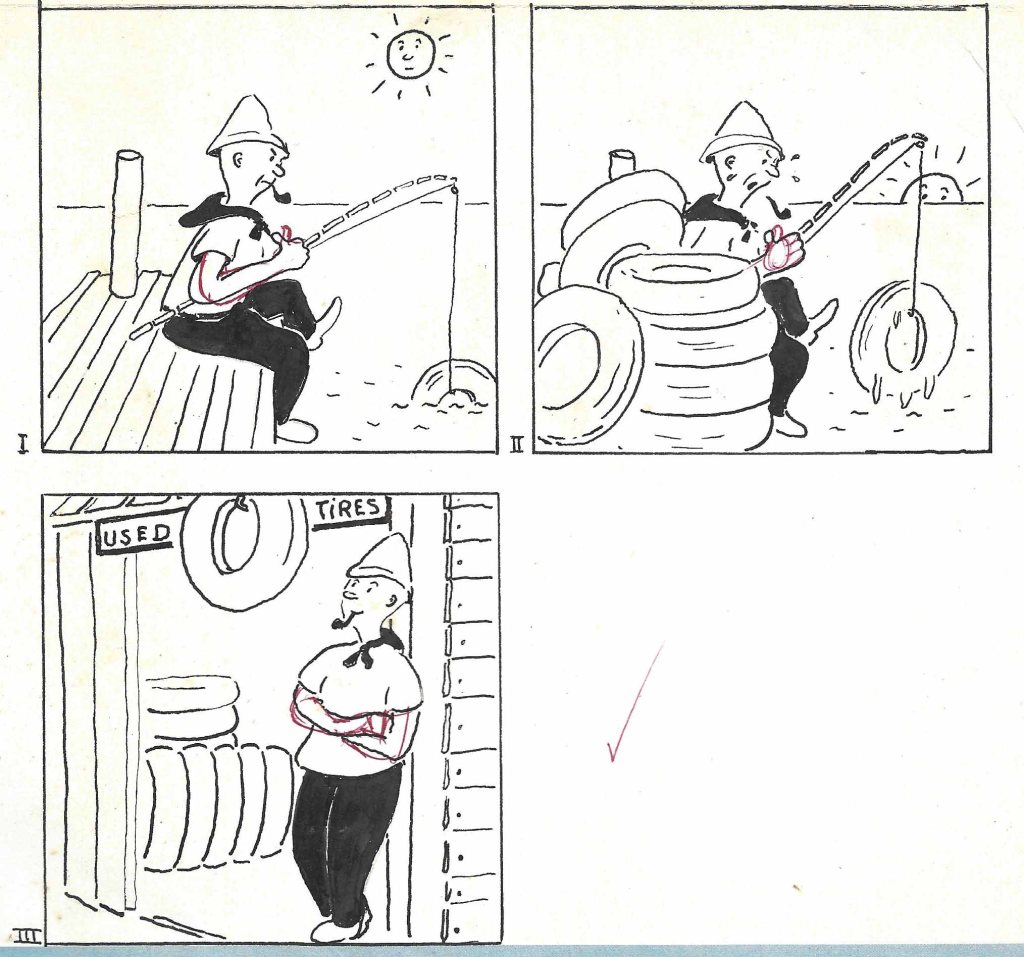
Continental Schools Course in Cartooning
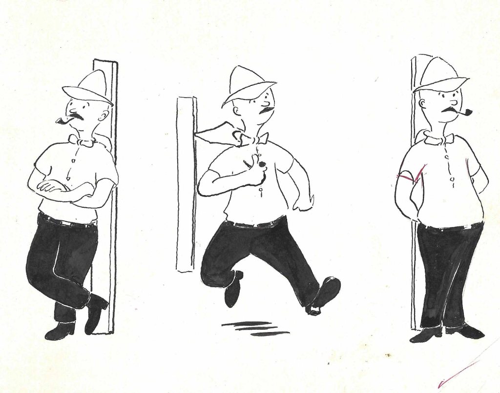
India Ink on Heavy Paper, Pen and Brush, 1962
17 cm x 13 cm and 17 cm x 16 cm (approx.)
The instructor’s marks in red.
India Ink on Heavy Paper, Pen and Brush, 1962
31.0 cm x 7.6 cm and 24.5 cm x 7.6 cm (approx.)
Pencil on Heavy Paper
21.0 cm x 25.0 cm (approx.)
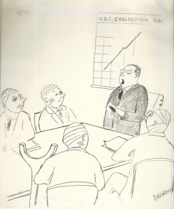
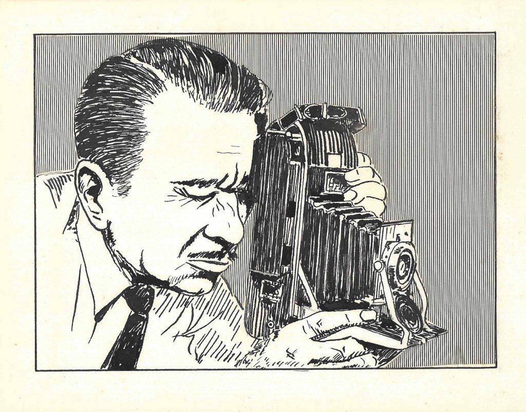
Carl submitted cartoons to magazines in the mid-1960s without success. This one almost doesn’t need a caption, although it would probably have had one in its final form, so it may not have been submitted. Although sketches were often permitted, Carl generally finished his cartoons in India ink on board before he sent out a batch. It is signed, however, which suggests a semi-final state.
Famous Artists Course in Commercial Art and Illustration
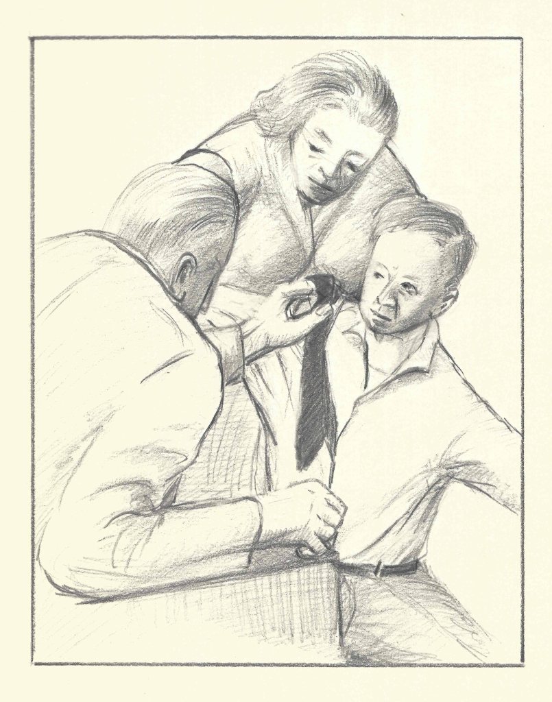
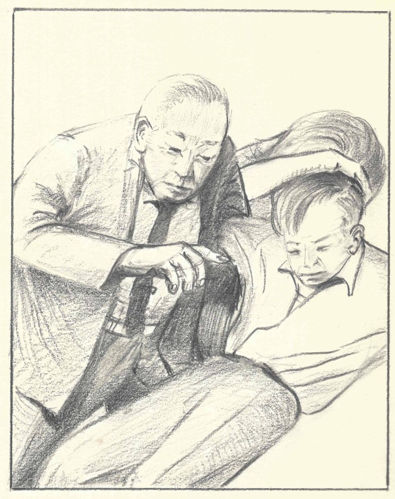
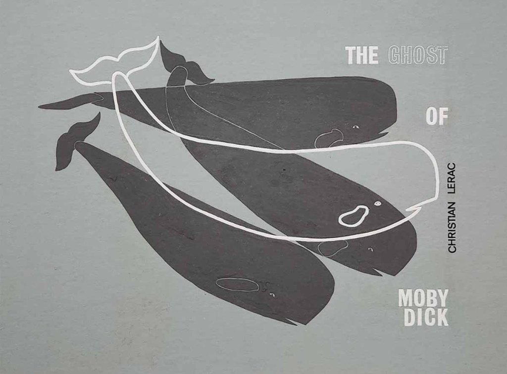
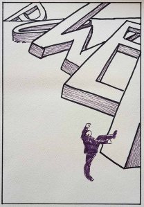
Illustrations for Fiction
1968–72 Pencil on Art Paper
Advertising Art
1968–72 Inks (3 colours) on Art Stock
21.8 cm x 28 cm
Probably an exercise for the Famous Artists’ Commercial Art and Illustration course

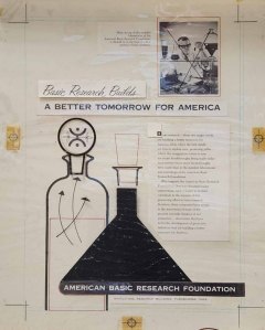
Annual Report
1968–72 Inks (2 colours) on Art Stock
21.6 cm x 28 cm
Probably an exercise for the Famous Artists’ Commercial Art and Illustration course.
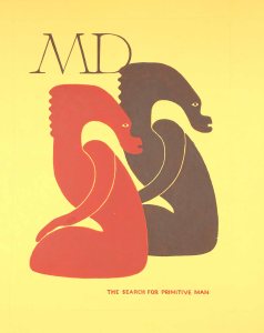
Magazine Cover Design
1968–72 Inks (2 colours) on Art Stock
21.0 cm x 27.8 cm
Probably an exercise for the Famous Artists’ Commercial Art and Illustration course

Clothing Ad; 1968-72 Watercolour or Guache and Ink on Art Board; 17 cm x 20 cm (approx.)
1968–72 Pen and Ink with Screentone on Paper
14.0 cm x 10.2 cm (approx.)
Screentone is a process for adding texture to drawings that are to be reproduced in halftone. It seems to me that there is a slight cutting error in the bottom right, but there is no indication the instructor pounced on that. The drawing was matted, an indication that Carl thought highly of it and intended to use it in his portfolio. (The Moiré effect is an artifact of digital photography. The actual tone is produced by straight vertical lines spaced sixty to the inch.)
Corporate Logo; 1968-72 Watercolour and Ink wash; 10.1 cm x 12.7 cm (approx.)
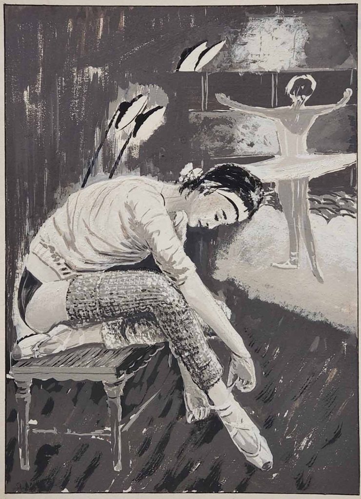
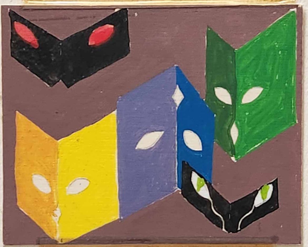
Ballerinas; 1966-68 Gouache and Ink on Art Board; 23.0 cm x 32.0 cm (approx.)
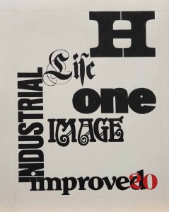
Lettering; 1966-72 India Inks on Poster Board; 24.3 cm x 30.4 cm (approx.)
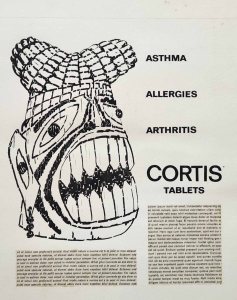
Cortis Tablets; 1966-72 Pen and Ink on Poster Board with Lorem Ipsum rubdown sheets; 25.5 cm x 31.1 cm (approx.)
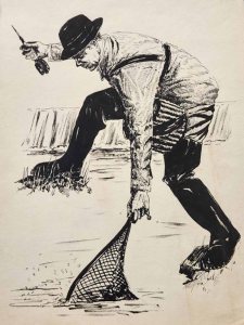
Stream Fishing; 1966-72 Pen/Brush and Ink on Heavy Paper; 21.5 cm x 28.5 cm (approx.)
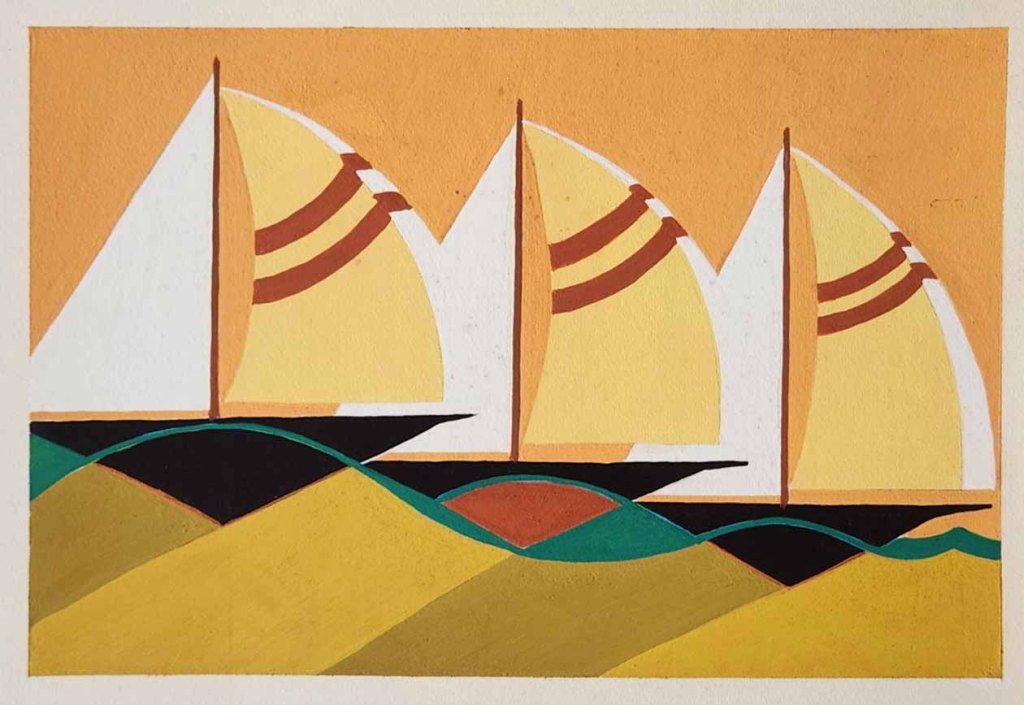
Yachts; 1966-72 Poster Paint on Art Board; 30.4cm x 20.4 cm (approx.)
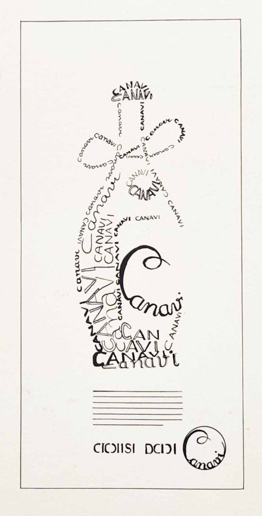
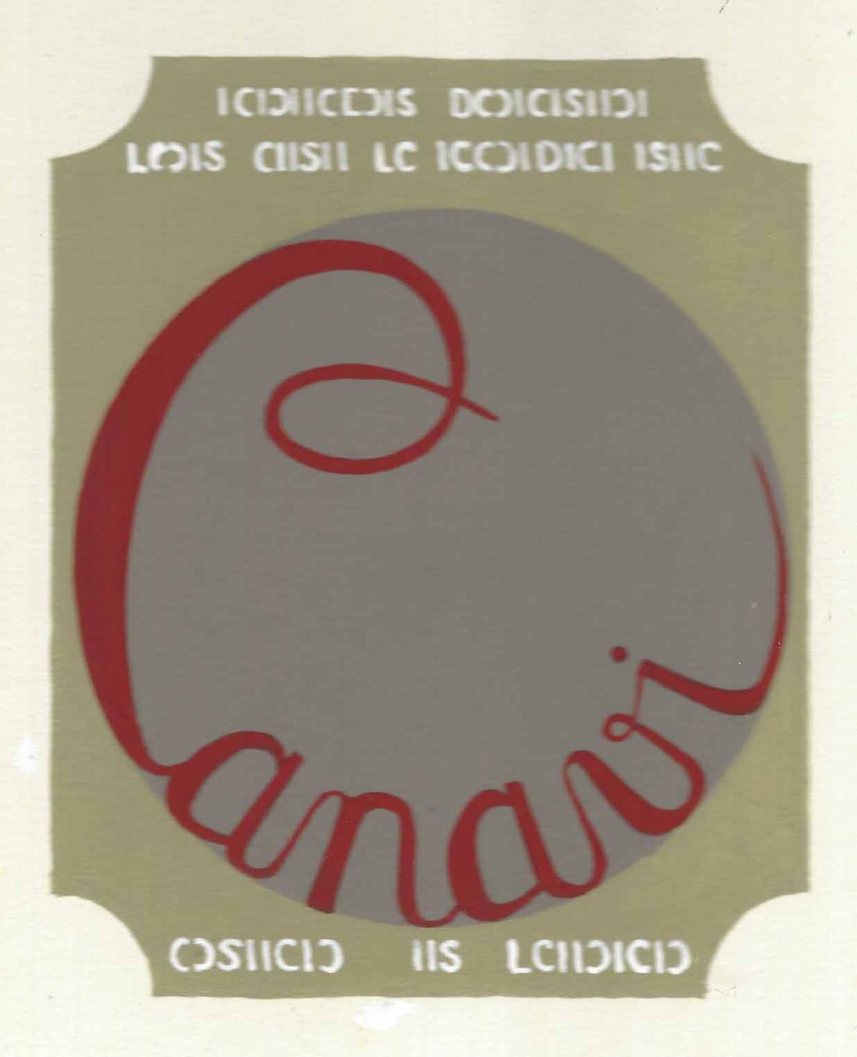
“Canavi” Ad; 1966-72 India Ink on Board; 12.8 cm x 28.8 cm
